
A/B Testing for Real-World Behavior: Seven Ways to Fool Yourself with Mobile Driving Data
The split is the easy part
Randomization is the only part of experimentation that feels as simple in production as it does in a textbook. Split users into control and treatment, measure outcomes, and compare the two. Clean, elegant, and almost suspiciously tidy. Unfortunately, real systems don’t behave like textbook experiments.
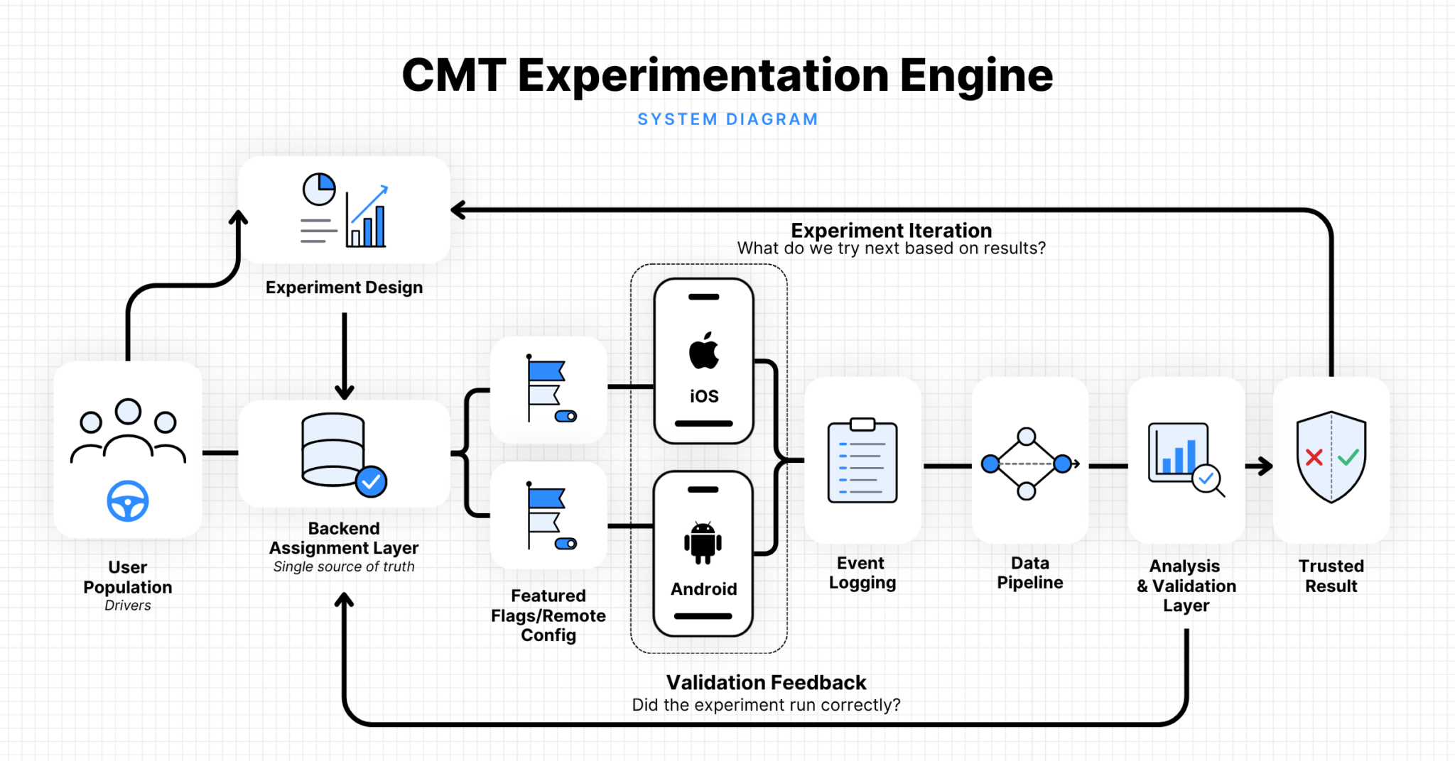
At Cambridge Mobile Telematics (CMT), our mobile experiments sit at the intersection of backend eligibility logic, iOS and Android apps with different release cycles, and data pipelines that try to turn real driving behavior into something measurable. The outcomes we care about—safe driving behavior, habit formation, engagement, retention—are slow, noisy, and deeply human. They don’t arrive as a nice, independent stream of clicks.
That changes the job. Assigning variants is straightforward, but making sure the result means what you think it means is where teams quietly get into trouble.
For teams running experiments on real-world behavioral data, most failure modes aren’t dramatic. They don’t announce themselves with stack traces. They show up as plausible dashboards, attractive p-values, and quietly wrong conclusions. Some of these are statistical. Some are baked into the systems we run. And some come from how we interpret the results.
Here are a few of the more common ways this happens, and how we try to avoid them.
1) Manufacturing sample size out of repeated measures
The most common statistical mistake in this setting is also the most consequential: treating every observation as independent when the experiment was randomized at the user level.
In our world, one driver may contribute many observations over time: trip counts, active days, weekly app opens, risky driving events, and retention checkpoints. Those observations are correlated. A person who drives frequently this week will probably drive frequently next week. Someone who never opens the app isn’t likely to become a power user by Tuesday.
A large row count can make the data look abundant, but it doesn’t make the observations independent.
This matters more than it might seem. A naive t-test applied at the observation level assumes independence. When each user contributes multiple observations across the study window, that assumption is violated. The effective sample size is smaller than the row count suggests. Not because the data is bad, but because repeat observations from the same person carry less independent information than observations from different people. Standard errors come out too small, power looks better than it really is, and everyone briefly feels confident. Then the result fails to replicate, or worse, gets shipped.
The principle here is simple: respect the unit of randomization. If users are randomized, the analysis has to account for user-level dependence. Sometimes that means aggregating to the user level. Sometimes it means mixed-effects models or cluster-robust standard errors. The exact estimator can vary, but the requirement to address within-user correlation doesn’t.
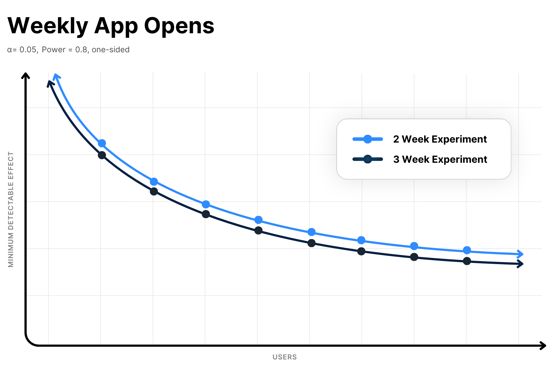
This matters before launch too. Power analysis should reflect the same correlation structure you expect at readout time. One useful way to express this is through the minimum detectable effect, or MDE: the smallest effect an experiment is realistically powered to detect under a given design. More weeks of data help, but the returns diminish when behavior is persistent within users.
Here’s an example MDE curve to make this concrete. Extending an experiment from two to three weeks lowers the minimum detectable effect, but the largest gains still come from adding independent users.
2) Pooling together users who are clearly not the same
Average treatment effects are useful, but they’re also capable of hiding almost everything interesting.
CMT serves different kinds of drivers in different contexts. Some drive professionally. Some are participating in rewards programs. Some are new and still forming habits. Others are stable, long-tenured users with very different baselines. These groups don’t behave the same way, and they don’t generate data at the same rate.
A pooled power calculation can therefore be technically correct and operationally useless. An experiment may look comfortably powered in aggregate while being badly underpowered for the subgroup the product team actually cares about. In practice, the smallest strategically important population is often the binding constraint on experiment design, not the largest one.
This is where MDE calculations earn their keep. We compute MDEs not just for the overall experiment, but also across plausible arm sizes, durations, and relevant subgroups. That forces the uncomfortable but useful conversation early: what effect size would be meaningful, for whom, and are we realistically able to detect it?
Designing for the average user is a good way to learn a lot about no one in particular.
3) Treating assignment as exposure because it’s convenient
A user can be assigned to treatment and never actually experience the treatment.
They may not open the app. They may be on an app version that doesn’t support the feature. They may fail eligibility checks after assignment. They may churn before the feature appears. In mobile experimentation, “assigned” and “exposed” are related concepts, not interchangeable ones.
Confusing the two creates two different problems. First, it dilutes effects: if a meaningful fraction of treatment users never see the feature, a real effect is harder to detect. Second, it tempts teams into a worse mistake: inferring assignment from downstream behavior. For example, treating “logged the treatment event” as evidence that the user belonged to treatment. That isn’t a shortcut. It’s a selection mechanism that conditions the analysis on behavior rather than on the randomization, and the resulting estimates aren’t intention-to-treat estimates anymore.
The fix is structural. Assignment should live in a single authoritative record with user ID, variant, and assignment timestamp. Exposure should be logged explicitly and separately, not inferred. The primary analysis is typically intention-to-treat. Exposure then becomes a diagnostic: how much of the assigned population could actually have received the experience we thought we launched?
This isn’t a subtle distinction. A null result that turns out to be a delivery problem, not a product problem, is a costly way to learn that assignment and exposure aren’t the same thing.
4) Starting the experiment before the app has actually arrived
Web teams can push code and watch traffic move almost immediately. Mobile teams don’t get that experience: app store review cycles can add days, user adoption of new versions is gradual, and rolling back a shipped change isn’t instant.
That means the moment a feature flag flips isn’t always the moment the experiment is truly live. On day one, treatment may be available only to a thin slice of users on the right app version. On day four, iOS coverage may be solid while Android is still catching up. On day eight, the backend logic may be stable while the long tail of older app versions is generating data in the control condition.
Ignoring these rollout dynamics means you may end up analyzing a mixture of product states rather than a clean experiment. Early reads become especially dangerous because they combine genuine treatment effects, version-adoption effects, and eligibility drift into a single number that’s hard to interpret cleanly.
The workaround is mostly operational discipline: ship dormant code ahead of time, activate via remote configuration, track app version everywhere, and stage exposure through internal or dogfood (employee-only) phases before involving production traffic. Just as important: define the “start” of the experiment in a way that reflects meaningful availability, not just the moment someone changed a config value.
Bottom line: mobile experimentation is slower than web experimentation. Pretending otherwise doesn’t make it faster. It just makes it harder to interpret.
5) Trusting cross-platform instrumentation on faith
Products that ship on both iOS and Android have a special talent for turning “the same event” into two subtly different measurements.
An event may fire on iOS but not Android. It may fire on both platforms, but at slightly different points in the user flow. The event name may match, while a critical field is missing on one platform. Or the event is technically present everywhere, but only after a certain app version, which is not the same thing at all.
The resulting charts can look surprisingly reasonable, which is part of the problem. Instrumentation mismatches don’t always produce obvious zeros. Sometimes, they produce apparent lifts that exist only because one platform is silently undercounting the control condition. A 12% improvement in a metric that’s defined correctly on only one platform is not a 12% improvement in anything meaningful.
We treat platform consistency as something to validate, not assume. Before analysis, we check event volumes, field completeness, version coverage, and semantic parity across iOS and Android. If a metric doesn’t mean the same thing on both platforms, it isn’t one metric. It’s two partially overlapping measurements, and the aggregate number reflects both.
6) Writing the metric definition after seeing the chart
Teams rarely think they have a metric definition problem. They discover they do when three people compute “weekly engagement” three different ways and each can explain, with confidence, why theirs is the obvious interpretation.
This is a boring failure mode, which is exactly why it’s dangerous.
Metrics don’t become precise because they sound precise. Retention, engagement, risky driving events, active weeks—each of these hides choices about source tables, denominator definitions, eligibility windows, censoring rules, late-arriving data, edge cases, and missingness. The version used for a product dashboard may not be appropriate for an experiment. The version used in a power analysis may not match either one.
If those differences surface only at readout time, the conversation becomes less about inference and more about figuring out which query is right.
So we pin metric definitions before launch. Not just the formula, but also the exact data source, filtering logic, population definition, and handling of edge cases. The point isn’t bureaucratic formality. It’s that an experiment result shouldn’t depend on who wrote the query that morning.
7) Reading the result before the data has finished arriving
With real-world behavioral data, not all outcomes arrive at the same time. Trips may be processed asynchronously. Safety-related features may depend on downstream enrichment. Eligibility data can lag. Some users produce data in bursts rather than on a consistent daily cadence.
The dashboard can end up ahead of the data, showing results before the underlying pipeline has finished. This can tempt teams to peek at results early and treat volatility caused by ingestion latency as evidence. In early reads, treatment and control can look artificially different simply because one side has more complete data at that moment. Wait a day or two, and the effect shrinks, reverses, or becomes appropriately boring.
The remedy is more procedural than glamorous. It requires knowing the latency profile of every metric you plan to use, predefining readout windows before the experiment runs, and distinguishing between a monitoring dashboard and an analysis dataset. “Fresh” and “complete” aren’t synonyms.
The checks that make results trustworthy
Before we read results, we run a short list of checks that have consistently mattered:
Cohort balance. If the intended split was 50/50, do the observed assignments match that expectation overall and within key slices? Large or systematic imbalances are more often caused by system behavior than by chance.
Assignment-to-exposure flow. How many assigned users could realistically encounter the feature? If treatment exposure is materially below expectation, power is lower and interpretation gets murkier.
Version and platform coverage. Which users were on eligible app versions, and when? Are iOS and Android both represented the way we think they are?
Join completeness. Do assignment, product events, and downstream outcome tables join cleanly? Missing joins are not a data-quality footnote. They can define the result.
Metric stability. Are the distributions, null rates, and data latencies behaving as expected? If a metric is drifting because the pipeline is drifting, the experiment isn’t the interesting part of the story.
These checks aren’t sophisticated. They just catch problems that sophisticated analysis can’t fix after the fact.
What this means for experiment design
Over time, a few principles have proven reliably useful.
Do the power analysis early, and do it with the real data structure in mind. MDEs aren’t ceremonial. They force you to confront variance, correlation, duration, and subgroup constraints before you commit to an experiment that can never answer the question you care about.
Keep assignment authoritative and boring. One backend-driven assignment record, joined everywhere downstream, eliminates an entire category of unnecessary ambiguity. There’s no inference from event presence, no variant logic duplicated across systems, and no ‘we think this is treatment’ SQL.
Use feature flags as a control plane, not a convenience. In mobile, shipping dormant code and activating later is often the only practical way to iterate without waiting on the app stores every time. Phased rollout and internal testing catch a surprising number of issues while they’re still cheap.
Treat instrumentation as part of the experiment, not a precondition that magically holds. If the logging is incomplete, asymmetric, or unstable, the analysis downstream doesn’t mean much.
Be precise about what you trust. “The experiment worked” isn’t a conclusion. “We observed a statistically credible improvement in engagement, with balanced cohorts, expected exposure, stable metric definitions, and no material platform inconsistencies” is much closer.
That level of specificity may sound fussy, but it’s also what separates evidence from hopeful pattern recognition.
Conclusion
Experimentation on real-world driving data isn’t hard because the math is exotic. It’s hard because the math has to survive contact with human behavior, asynchronous data, multiple platforms, slow releases, and the occasional broken event.
At CMT, that reality has led us to treat experimentation as both a statistical discipline and a systems discipline. The estimator matters, but so does the assignment layer, the logging, the rollout plan, and the metric definition. A clean p-value at the end doesn’t absolve a messy process upstream. The goal is not just to run experiments, but to know when to believe them.
Ultimately, the most dangerous experiment result isn’t the noisy one. It’s the one that looks clean, ships quickly, and is wrong.
Like how we think? Come build with us.
About the Author
Lisa Pinals is a Principal Machine Learning Engineer II, Data Insights, at CMT.